
Cards
Usage
To use the Card component, simply import it and add it to your JSX code.
Example
Classes/Tailwind
Inline CSS
Simple card with text
A simple card
Lorem ipsum dolor sit amet consectetur adipiscing elit.
Card with media

Moraine
Moraine Lake is a glacially fed lake in Banff National Park. The lake, being glacially fed, does not reach its crest until middle to late June. When it is full, it reflects a distinctive shade of azure blue.
Styling variations
Here are some examples of how you can style the Card component. Some of the examples below are inspired by the Vuesax library, which used to be my go-to UI library until it was discontinued.
Example
Classes/Tailwind
Inline CSS
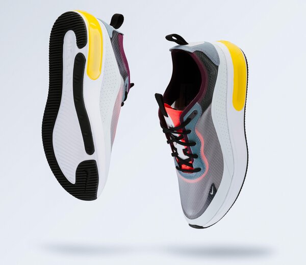
AIRDUNKERS
$299.99
X-ATHELETE COLLECTION
SIZE
COLOR

Tempus Nova
$12,000
Experience the ultimate fusion of style and technology with the Tempus Nova watch. Crafted with precision engineering, this timepiece features state-of-the-art materials that ensure unparalleled durability and accuracy.

Finibus Bonorum et Malorum
Lorem ipsum dolor sit amet, consectetur adipiscing elit, sed do eiusmod tempor incididunt ut labore et dolore magna aliqua. Ut enim ad minim veniam

Finibus Bonorum et Malorum
Lorem ipsum dolor sit amet, consectetur adipiscing elit, sed do eiusmod tempor incididunt ut labore et dolore magna aliqua. Ut enim ad minim veniam

Finibus Bonorum et Malorum
Lorem ipsum dolor sit amet
Props
| Prop name | Type | Default value | Required | Description |
|---|---|---|---|---|
hoverEffect | boolean | true | An optional flag to enable/disable hover effect. Default is true. | |
...other | any | Any additional props passed to the component will be spread here. |